Website accessibility: requirements and practice
Website accessibility means the site can be used by as many people as possible, including people who use keyboard, screen reader, zoom or need good contrast. For a Norwegian business, this is a legal requirement, a quality requirement and a conversion requirement.
Many think accessibility is something the public sector must care about. That is too narrow. If a customer cannot read the text, use the menu, fill out the form or understand the error message, you do not only lose accessibility. You lose trust.
At wevo, I build websites for businesses in Norway with accessibility as part of the foundation. Not as an add-on at the very end, but as a natural part of design, code, content and testing.
What does website accessibility mean?
Website accessibility means that the solution is made so people with different needs can use it. It is about contrast, text size, keyboard navigation, screen readers, structure, link text, forms, error messages, video, images and mobile use. The Norwegian Authority for Universal Design of ICT explains the requirements for universal design of ICT in Norway, and WCAG is the technical standard used as the basis.
Think of Anne, who runs a hair salon in Bergen. She has a nice website, but the booking button has low contrast, the menu works poorly with keyboard, and the form only says error when something is missing. To Anne, the site feels finished. To the customer who cannot book an appointment, the site feels broken.
Which requirements apply to Norwegian websites?
Norwegian organisations must follow rules for universal design of ICT. The authority describes the requirements and points to the WCAG criteria used for web solutions. In practice, this means the website must be possible to perceive, operate, understand and use with different assistive technologies. For updated rules, check uutilsynet.no and relevant pages about WCAG and ICT requirements.
| Principle | What it means | Typical website mistake |
|---|---|---|
| Perceivable | Content must be visible or perceivable in another way. | Images lack alt text or contrast is weak. |
| Operable | The site must work with keyboard and other tools. | Menu and forms require a mouse. |
| Understandable | Text, forms and errors must be clear. | Error message only says something went wrong. |
| Robust | The code must work with browsers and assistive technology. | Wrong HTML makes screen reader use messy. |
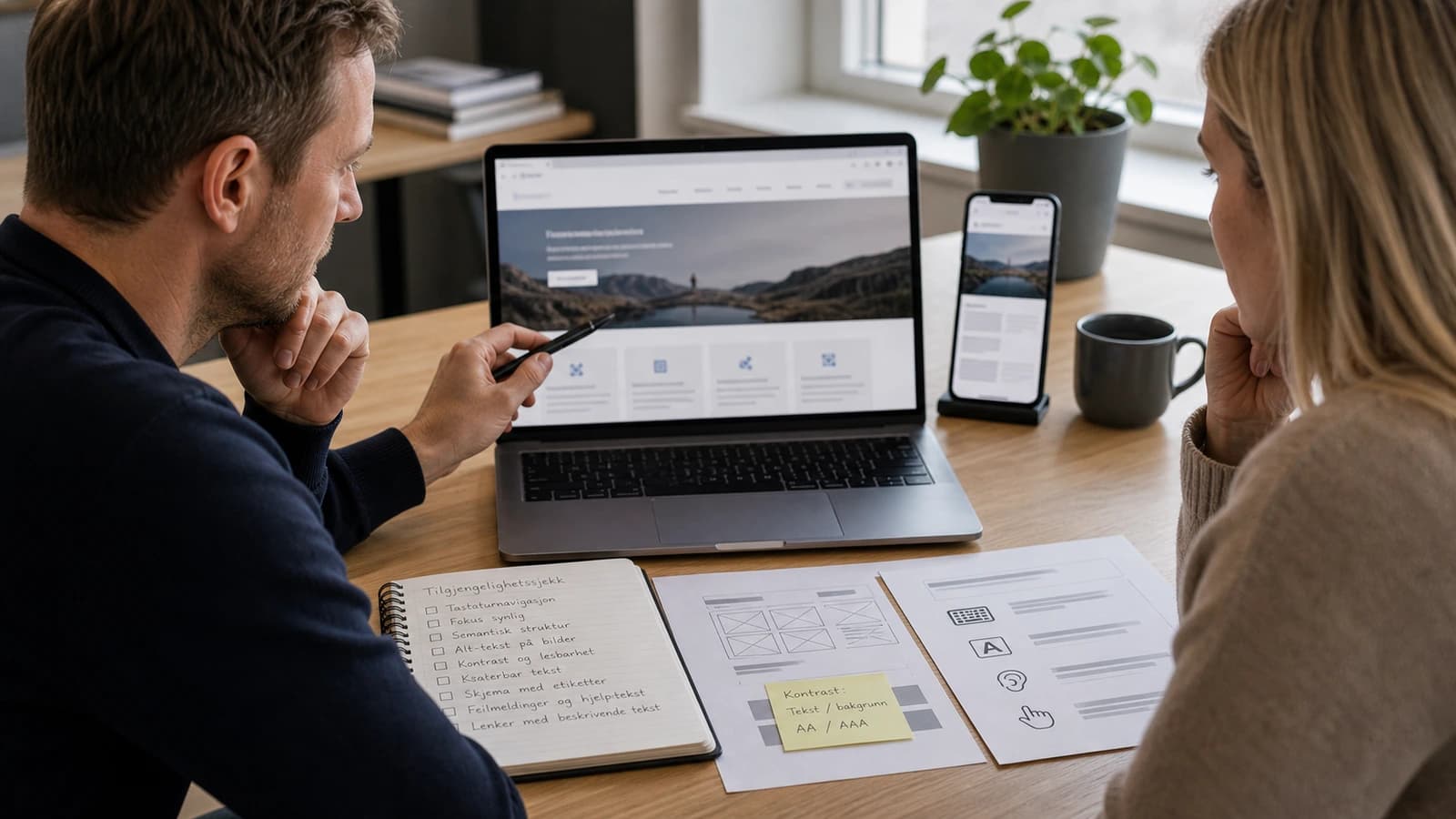
What are the most common mistakes on business websites?
The most common mistakes are rarely advanced. They are small choices repeated: too little contrast, buttons without clear text, images without alt text, forms without labels, headings in the wrong order and focus indicators removed because someone thought they looked ugly. The result is a page that looks nice, but is hard to use.
- Check that text and buttons have good contrast against the background.
- Navigate the whole page with keyboard without using a mouse.
- See whether focus indication is visible when tabbing through the page.
- Check that all forms have labels and clear error messages.
- Use the correct order for H1, H2 and H3.
- Write alt text that describes meaningful images.
- Test the site on mobile with enlarged text.
A dentist in Trondheim can lose patients if the form is hard to use. A builder in Tromsø can lose enquiries if project images are not explained well enough. A restaurant can lose table bookings if the menu exists only as an image without text. This is not theory. It is contact points that either work or do not work.
The same applies to language. A button that says send is fine, but a button that says send enquiry is better. An error message that says error is poor, but one that says enter phone number is useful. Accessibility is often about removing guesswork.
How should content be written for website accessibility?
Good accessibility also lives in the text. Short sentences, concrete headings and clear links make the page easier to use. Do not write click here. Write what the link does. Do not hide important information in long paragraphs. Use subheadings that say what the customer gets answered.
- Write link text that makes sense alone.
- Use one main point per paragraph.
- Avoid jargon when the customer does not need it.
- Explain forms and choices before the customer has to fill them in.
- Let important actions have concrete text.
How does accessibility affect conversion?
Accessibility and conversion often point in the same direction. A clear button helps both a screen reader user and a stressed mobile customer. Good contrast helps both people with low vision and people standing outside in sunlight. Clear error messages help both people with cognitive challenges and everyone filling out forms quickly.
- Clear buttons make the next step easier.
- Correct structure makes the page easier to understand for people and search engines.
- Good forms create fewer abandoned enquiries.
- Alt text helps both accessibility and content understanding.
- Mobile friendliness improves when interactions are built with enough space.
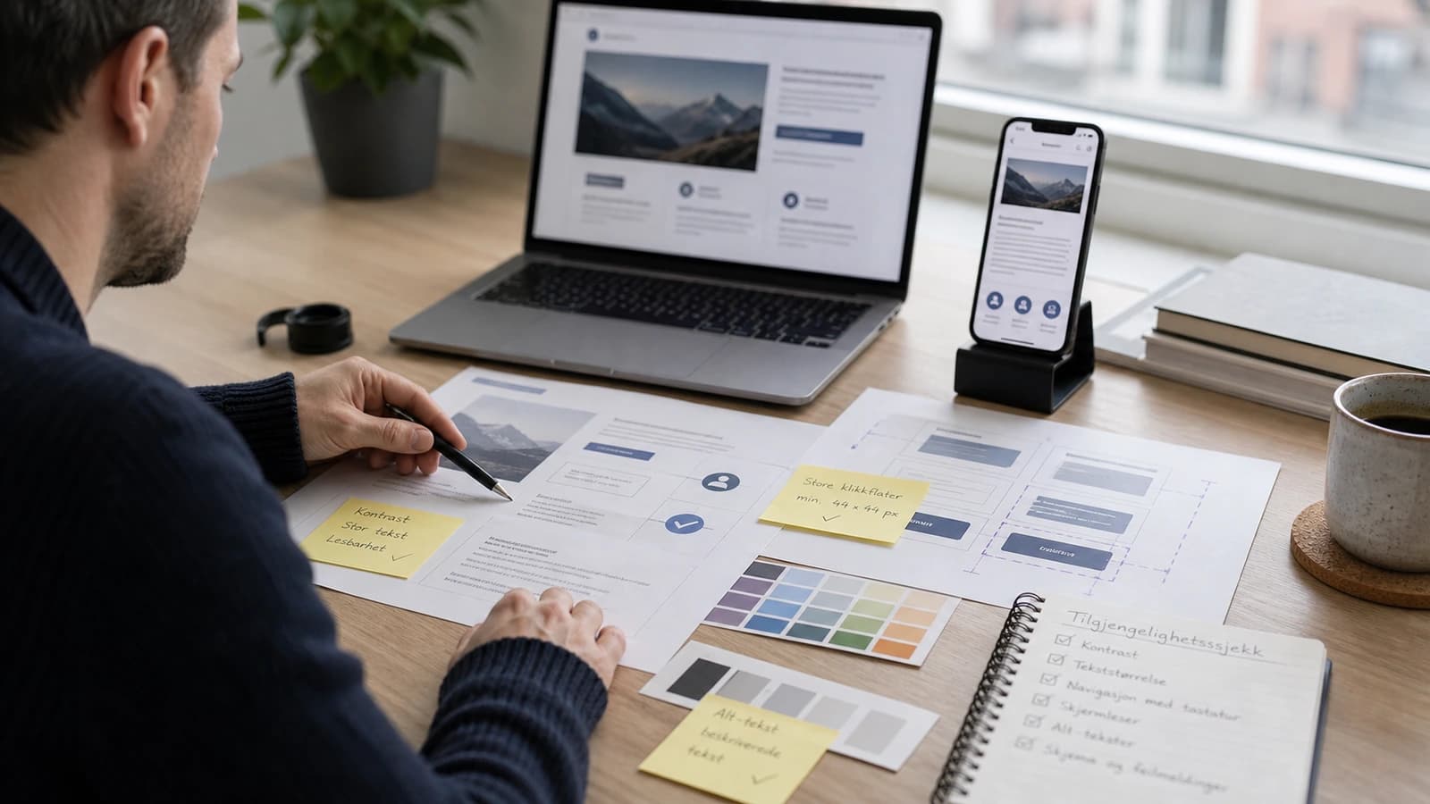
How does wevo build accessibility into websites?
I start with structure. A page must have tidy headings, real buttons, correct links and forms that the browser can understand. Then comes design: contrast, space, readable text, clear hover and focus states. Finally the site is tested practically with keyboard, mobile and automated tools.
This connects closely with responsive website, Core Web Vitals and website maintenance. An accessible site must also be fast, stable and maintained. If new blocks are added later without the same quality, accessibility can decay.
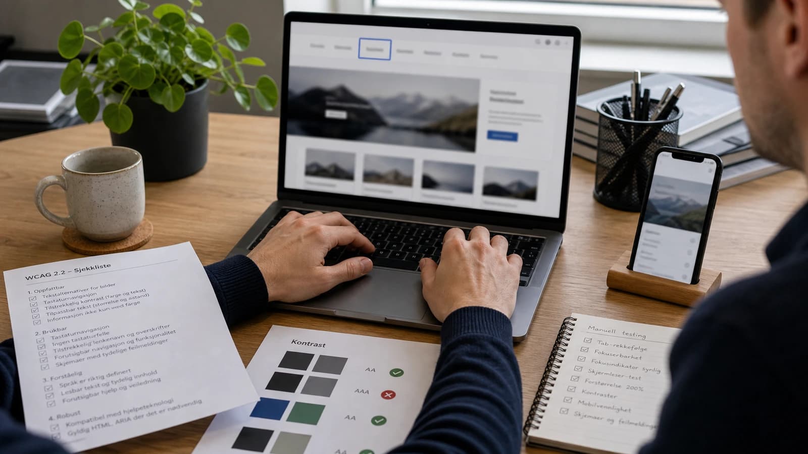
What should you check before launch?
Before launch, accessibility should be checked as part of quality assurance, not as a panic round. The most important thing is to test real user flows: open the menu, read the service page, fill out the form, send an enquiry and find contact information. If these flows work well, the site has a better foundation.
- Test main menu, CTA and form with keyboard.
- Check contrast on text, buttons and links.
- Read the page by heading structure, not only visually.
- Check alt text on images that carry meaning.
- Make sure error messages explain what the customer must fix.
- Test enlarged text and a normal mobile screen.
If you want to build this correctly from the start, accessibility should be part of the requirements for websites for businesses. It gives a site that handles customers, legal requirements and future growth better.
For me, this is craft. A website should not only impress at first glance. It should work when the customer has little time, poor light, limited motor control, a weak screen or uses assistive technology. Then the site becomes more robust for everyone.
It is also easier to maintain a site that is built correctly. When structure, contrast and forms are right from the start, you avoid repairing the same mistakes every time the site grows.
What is website accessibility?
Website accessibility means that the site can be used by as many people as possible, including with keyboard, screen reader, enlarged text or other assistive tools.
Is accessibility a requirement in Norway?
Yes, Norwegian organisations must follow requirements for universal design of ICT. Check uutilsynet.no for updated rules and WCAG requirements.
What is WCAG?
WCAG is an international standard for accessible web content. It is used as the technical basis for many accessibility requirements.
How do I test accessibility quickly?
Start with keyboard testing, contrast, heading structure, forms, alt text and mobile with enlarged text. Automated tools can then support the check.
Want help with this? See how we work with websites.
Not sure where your website stands?
Run a free analysis and get an honest picture of speed, structure and things that could be stopping your customers.