Restaurant website that fills tables
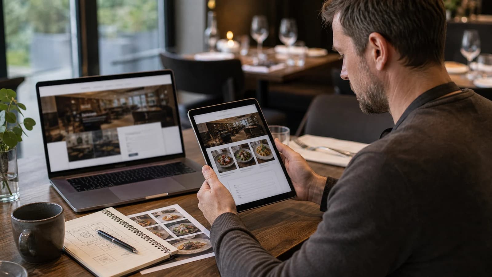
A restaurant website is about one thing: making the choice easy for a hungry guest standing on the street with a phone in hand. The guest wants to see the food, feel the atmosphere, find the opening hours and know how to book a table. If the site cannot answer that quickly, she moves on to the next place.
Most restaurants have a fine profile. A good kitchen, a room with soul and people who care. But the digital presentation often lags behind. The menu sits as an old PDF, the photos are generic, and table booking is hidden behind a phone nobody has time to answer. That loses guests who were ready to come.
At wevo, I build restaurant websites that combine real visual quality with fast mobile use, a structured menu and simple contact. The job is to sell the experience and make the next step easy for the guest. Here is how I think about a restaurant website that actually fills tables.
What should a restaurant website contain?
A restaurant website is a digital presentation of menu, concept, location, practical information and contact flow for guests. It should show food, atmosphere, opening hours and location without the guest searching. Think of a pizzeria in Drammen. The guest wants to know three things before going: what does it cost to eat here, what does the place look like, and is it open now. Answer that within seconds and you have already won.
A cafe in Bergen needs something different from a fine dining restaurant in Oslo. The cafe must make takeaway, opening hours and allergy information easy to find. The fine dining place must show a seasonal menu and make table booking easy. But the core is the same: the guest should never have to guess.
Why the menu should be text, not an image
The most common mistake I see is the menu sitting as an image file or a PDF. It feels easy, because the kitchen already has the menu in a design program. But for the guest on mobile it becomes a zooming exercise. And for Google and screen readers the menu barely exists, because the text is locked inside an image.
When the menu is real text on the page, several things happen at once. It becomes readable on a small screen. It can be found in search when someone looks for a specific dish. It works with screen readers for guests who need it. And it becomes much easier to update when the season changes or a dish leaves the menu.
- Write the menu as content on the page, not as a file the guest must download.
- Split the menu into clear sections: starter, main, dessert, drinks.
- Mark allergens and special diets so the guest does not have to ask.
- Keep the menu updated, so nobody is disappointed at the table.
- Let a PDF be an extra for printing, never the only menu.
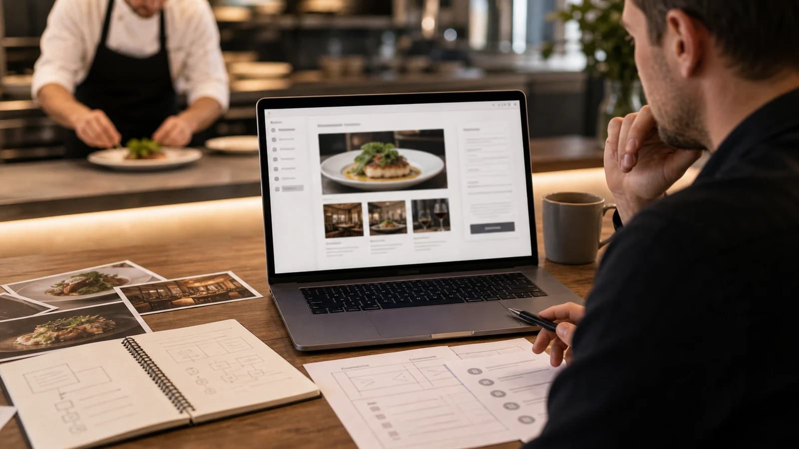
Mobile first: people search on the street
A guest looking for a place to eat almost always does it on the phone, often while walking. Then you do not have a whole front page to play with. You have the top of a small screen and a few seconds. That means the most important choices must sit high: menu, opening hours, map and contact.
Mobile first also means the site must be light. Large, uncompressed images make the experience slow, and a slow site loses guests before it even shows. This connects to a responsive website, where the layout adapts to the screen instead of pushing a desktop version onto a phone.
- Put menu, opening hours, map and contact at the top on mobile.
- Compress images so the page loads fast on mobile data.
- Use large tap targets for buttons like call and get directions.
- Test the site on a real phone, not only on a large screen.
- Make sure the address opens a map with one tap.
Photos that sell the experience
Food is a visual experience, and the guest buys with the eyes before buying with the mouth. Real photos of the food, the room and the people give confidence. Generic stock photos do the opposite: they signal that the place does not look like what you see. A guest notices the difference immediately.
At the same time, photos must not drown the practical information. I often see sites with much atmosphere and little fact. The guest feels inspired, but finds neither opening hours nor address. The balance is simple: the photos create desire, the text makes the choice possible. Both must be there.
- Real photos of the food, the room and the people who work there.
- Right size so the photos are sharp without making the page heavy.
- Good descriptive alt text so photos work for search and screen readers.
- Atmosphere and fact together, never atmosphere that hides the practical info.
Table booking and contact without confusion
Many restaurants mix all enquiries in the same messy inbox. Table requests, events, catering and common questions arrive in the same place, and something falls between the cracks. A good restaurant website separates these, so each enquiry lands in the right flow.
Table booking can be useful, but it must not become aggressive. If a large booking form covers the whole screen before the guest has seen the menu, you lose people who only wanted to look first. Let the guest explore, and make booking easy to reach when she is ready. A simple contact flow can also connect to systems that gather enquiries in one place.
| Element | How it should be | Common mistake |
|---|---|---|
| Menu | The food is shown as text with structure and allergens. | Old PDF or an image of the menu. |
| Photos | Real photos show food, venue and atmosphere. | Generic photos that do not look like the place. |
| Mobile | The guest finds menu, map and contact quickly. | Important information sits far down the page. |
| Table booking | Tables and events go to the right flow. | All enquiries arrive in the same messy inbox. |
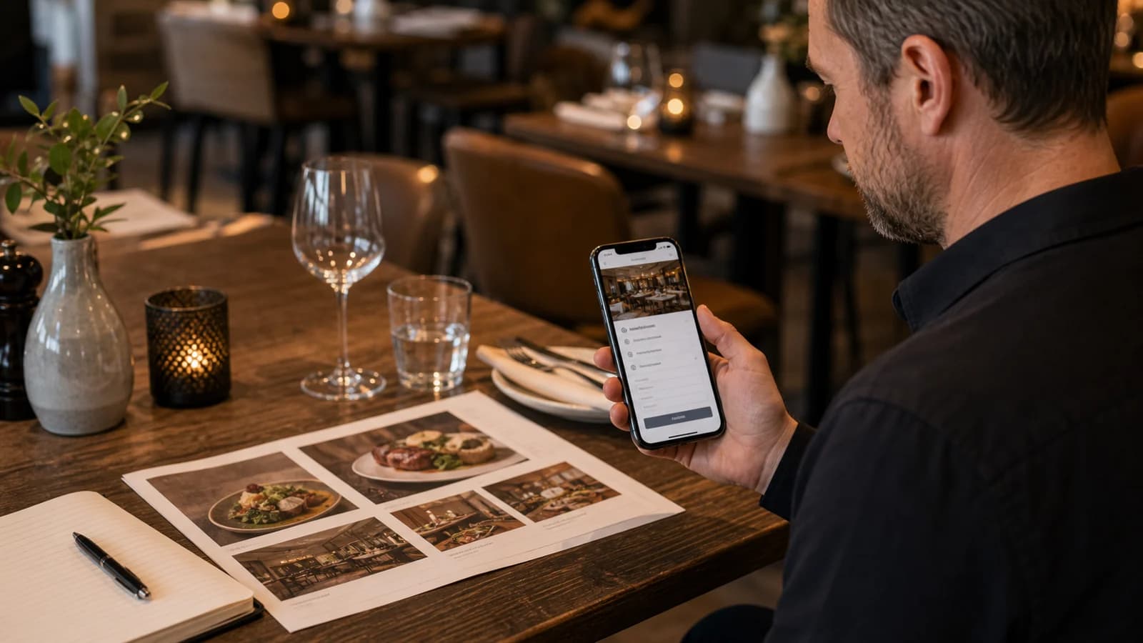
Opening hours, map and local visibility
Many guests search for food nearby exactly when they are hungry. Then the address, the opening hours and the map must be clear both on the site and in Google. A guest who cannot find out whether the place is open moves on. A guest who cannot find parking or the entrance gets frustrated before arriving.
Your website and your Google profile should tell the same story. If the opening hours differ between the two, the guest loses trust. This is the core of local SEO and Google Business Profile, where the website and the profile work together to make you visible when someone searches in the neighbourhood.
Common mistakes on restaurant sites
The mistakes I see recur, and they are rarely advanced. They are about priority. When a restaurant builds the site itself, it often becomes a display of nice photos without the practical info the guest is actually looking for.
- Too much atmosphere, too little fact: the guest feels inspired, but cannot find opening hours or address.
- Too heavy page: large images make the mobile experience slow.
- Outdated menu: wrong content creates disappointment before the visit.
- Too aggressive table booking: a large form that hides the menu scares guests away.
- Menu as an image: the text exists neither for search nor screen reader.
A restaurant in Tromsø can lose guests if the menu only sits as a PDF. A cafe in Bergen can lose customers if the opening hours are wrong. A pizzeria in Drammen can lose orders if the site is too slow on mobile. This is not theory. It is contact points that either work or do not work.
How wevo builds a restaurant website
I start with the guest's most important questions: menu, opening hours, place and contact. Then I choose a structure where these sit high on mobile. The menu is built as text, not as a file. The photos are chosen to show real food and room without making the page heavy. Finally the site connects to local visibility and a simple way for staff to update content.
The goal is a site that is fast, easy to maintain and simple to use for a guest in a hurry. When structure, menu and photos are right from the start, you avoid repairing the same things every time the menu changes or the opening hours shift. Remember too that a restaurant site collecting contact info must handle cookies and consent correctly.
A restaurant website is the right next step when the place has food and experience people should see, but the digital presentation does not make the choice easy enough. If you want to build this correctly from the start, these requirements should go into the foundation for websites for businesses.
What should a restaurant website contain?
It should contain menu, real photos, opening hours, address, map, contact and optionally table booking or event requests.
Should the menu be PDF or normal page content?
Normal page content is better for mobile, search and updates. A PDF can be an extra for printing, but should never be the only menu.
Are photos important for restaurants?
Yes, real photos of food and venue give the guest confidence and make the choice easier. Generic stock photos weaken trust.
Do restaurants need local visibility?
Yes, many search for food nearby. A clear address, opening hours and an updated Google profile help both guests and search engines.
Want help with this? See how we work with websites.
Not sure where your website stands?
Run a free analysis and get an honest picture of speed, structure and things that could be stopping your customers.